
Boost your mobile app to a wider user base!
When we talk about accessibility, we are talking about people who cannot take full advantage of modern technology if the technology doesn’t make sense to them or if it is hard for them to use. They may be people with visual impairment, cognitive impairment, motor impairment, or just people who are naturally aging.

According to a survey conducted in 2020, “smartphone adoption is 86 percent among Americans aged 50 to 59 and 81 percent for those 60 to 69. Meanwhile, 62 percent of those 70 and older use smartphones”. Population data (till July 1, 2020) shows that among US residents, there are 41.99 million people aged between 50 to 59, 38.67 million people aged between 60 to 69, and 37.77 million people aged above 70. You can tell how many potential mobile app users there are. This is just an example of people who naturally age, to illustrate how valuable it is to make a mobile app accessible for them to use.
The Americans with Disabilities Act (ADA) requires all mobile apps to be accessible to the disabled without any discrimination. It is important to note that there are different standards for apps with different nature (e.g., commercial business vs. government) – It is certainly necessary and worthy to devote effort to design an accessible mobile app.
Keeping the following check points in mind will help you when designing and developing a mobile app to ensure its accessibility.
![]()
Color Contrast and Color Choice
Check the color contrast ratio of the foreground and background. You can simply use an online tool (e.g. https://webaim.org/resources/contrastchecker/) to test it to make sure that the ratio is above 4.0. Low color contrast ratio harms the readability of the content.
See below. The first one is an example of bad readability due to the low color contrast ratio while the second one is an example of proper readability due to the proper color contrast ratio.

Bad Readability

Good Readability
Additionally, when choosing the color, avoid color combinations like red and green, which might be difficult for color blind people.
![]()
Typography Choice
Use Sans Serif fonts for your app. They are much easier to read compared to the serif fonts since there is no decorative element. The commonly used sans serif fonts are for example, Helvetica, Arial, Open Sans, etc.
Below are examples of some common Serif fonts and Sans Serif fonts. You can see that the Serif fonts look more decorative which slow down your reading speed.
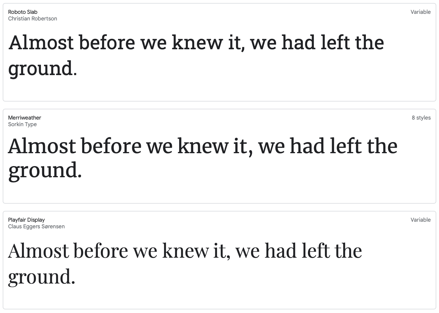
Serif Fonts
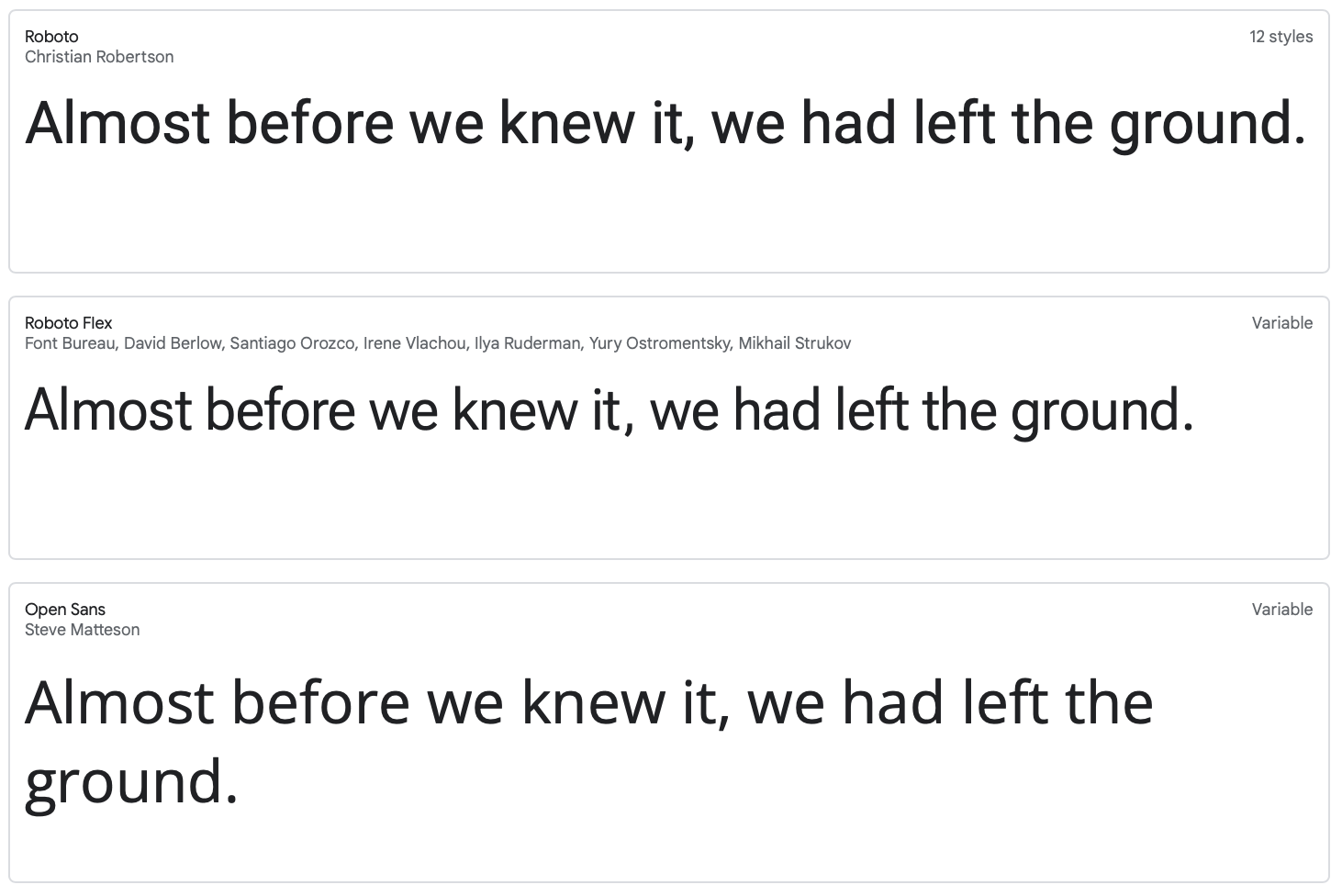
Sans Serif Fonts
Also, limit the number of fonts to one or two. Effectively use different weights of a single font to build visual hierarchy.
![]()
Size of Interactive Area
On mobile apps, in order to avoid mistouching, the smallest interactive zone should be no less than 9 x 9mm. Set proper interactive zones for the interactive elements.
See the pink highlights below which indicate the interactive areas. Instead of only setting the down arrow as the interactive item, I suggest to set the whole white card as interactive, which allows easier tapping.
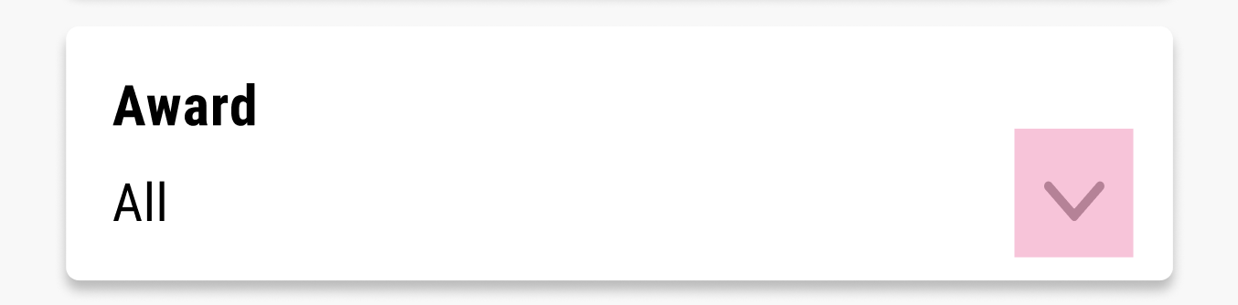
Small interactive area which is hard to tap
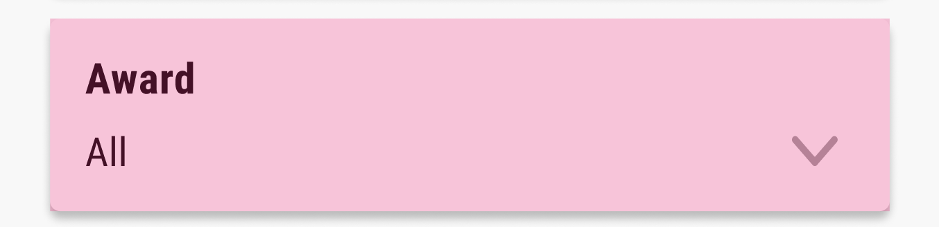
Proper interactive area
![]()
Dark Mode
For people who have cataracts (which is normal during aging), design a dark mode to better accommodate them since they perceive dark mode better. A few tips on designing the dark mode;
- Don’t use pure black (#000000) and white (#ffffff). Instead, use dark grey as background and semi-transparent white as foreground.
- Be aware of color contrast ratio of the dark grey and your branding color. Re-test the color contrast ratio and adjust. It is possible that the color works well in light mode but doesn’t work in dark mode.
Below are the light mode and dark mode for Google Map. It is necessary to switch between different mode for different light conditions.
Light Mode
Dark Mode
![]()
Don’t convey message by color only
Messages should be able to be perceived in other ways as well. For example, if you use a bar chart, don’t only rely on color to represent different variants. Instead, add some texture to the legend. In other cases, you can also add instruction texts, graphics, etc.
Even though, you can set the design to a grey scale and test if you are able to perceive all the information easily.
![]()
Organized Task Flow and Information Architecture
Design the task flow in a reasonable and logical fashion. You can also divide large tasks into small steps or display short paragraphs instead of big chunks of paragraphs.
Organized information architecture is easy to navigate and save people’s energy and time to look for certain things.
![]()
Description and Trait for UI Elements
When writing the code, be careful of the trait and alt-text for each UI element. Make sure all of them have accurate descriptions because screen readers extract what you write as the traits and alt-texts, and read them to people with visual impairment. These users rely heavily on the descriptions to navigate the app.
You can close your eyes and walk through the app with voiceover/screen readers to determine whether it is friendly to the disabled to complete certain tasks.
![]()
A Few Tools to Check Accessibility
Run your app with the following tools. These tools will generate a report and point out where it needs to be improved. They basically check the color contrast ratio, interactive area size and alt-text.
- Accessibility Inspector for iOS app
- Android Studio has its internal tool for Android app
- Accessibility Scanner for mobile app
Accessibility has usually been overlooked. It is much more cost-efficient and effort-saving to allocate resources to build accessibility at the beginning, than fixing accessibility issues after the app has been completed. An app with good accessibility will be exposed to more population than the one with poor accessibility. In addition, it will also create a better user experience and therefore encourage more installations.
You can reach out to our experts at Logic Solutions to help you with excellent accessibility to boost your mobile app to a wider audience!