
COVID-19 has dramatically changed our daily activities. Our dependence on online activities has abruptly risen, such as online meetings, online shopping, and telemedicine to name a few. To continue with life, customers and businesses have had to switch from offline to online activities.
Since the pandemic, safety has come into play, both physically and digitally. Many companies are making efforts to provide users a sense of safety during the crisis. This sense of safety can be achieved in different ways. For example, online meeting tools have increased the encryption level to protect users’ privacy. From the user experience perspective, one of the principles is to increase information visibility to users.
Let’s check a few leading grocery apps to learn what is good user experience and assist those users, especially during the pandemic.
Ease customer concerns about COVID-19
Empathy is the first step in creating a good user experience, especially during this difficult time. Empathy allows a designer and a business to think deeper into what users are facing. People are already worried enough about the spread of the virus. A business can specifically show what they have done to protect customers from potential infection and ease customers’ concerns.
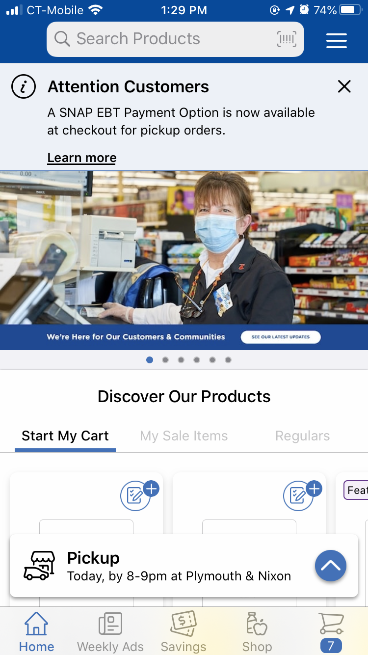
For example, Walmart puts COVID-19 updates at the top of their shopping page. Users can tap and learn what Walmart is doing to provide a safe shopping environment. In addition, after updating the app to the recent version, a page popped up showing specifically what Walmart is doing to prioritize safety.
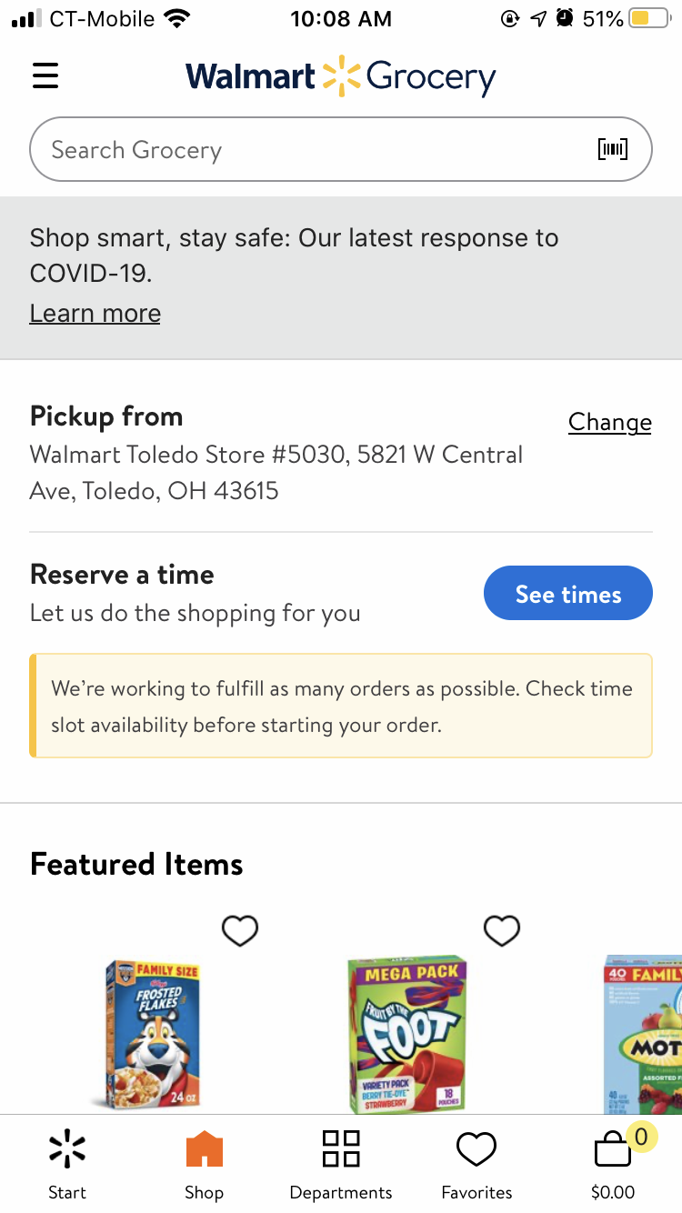
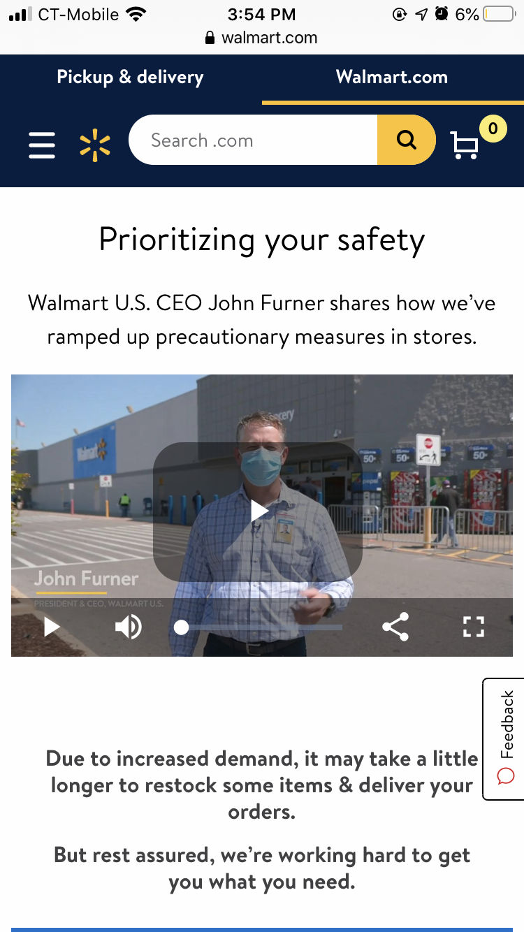
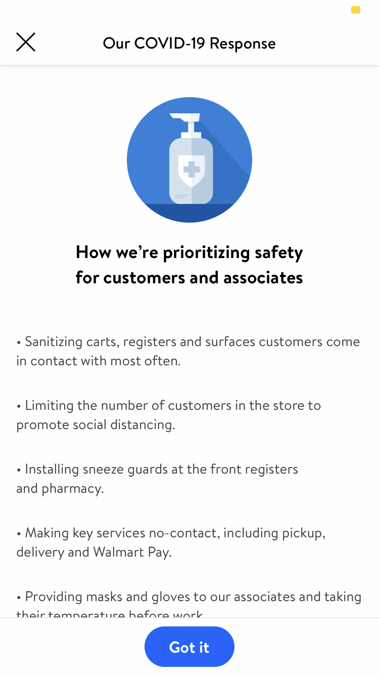
screenshots from the Walmart app
In the Kroger app, there is a designated FAQ section for COVID-19, which is explicit for users to look for COVID-19-relevant answers. Users can find this section with little effort since it builds on the existing information architecture and follows people’s mental model.
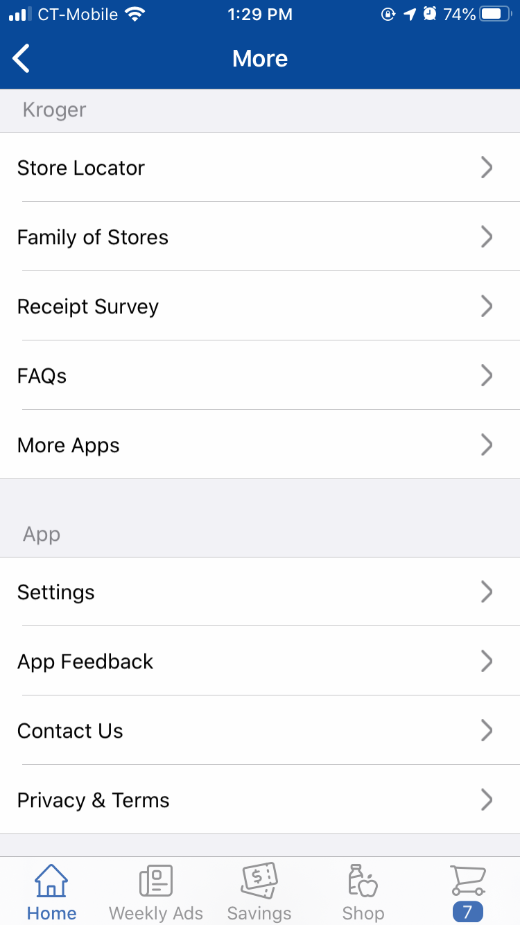
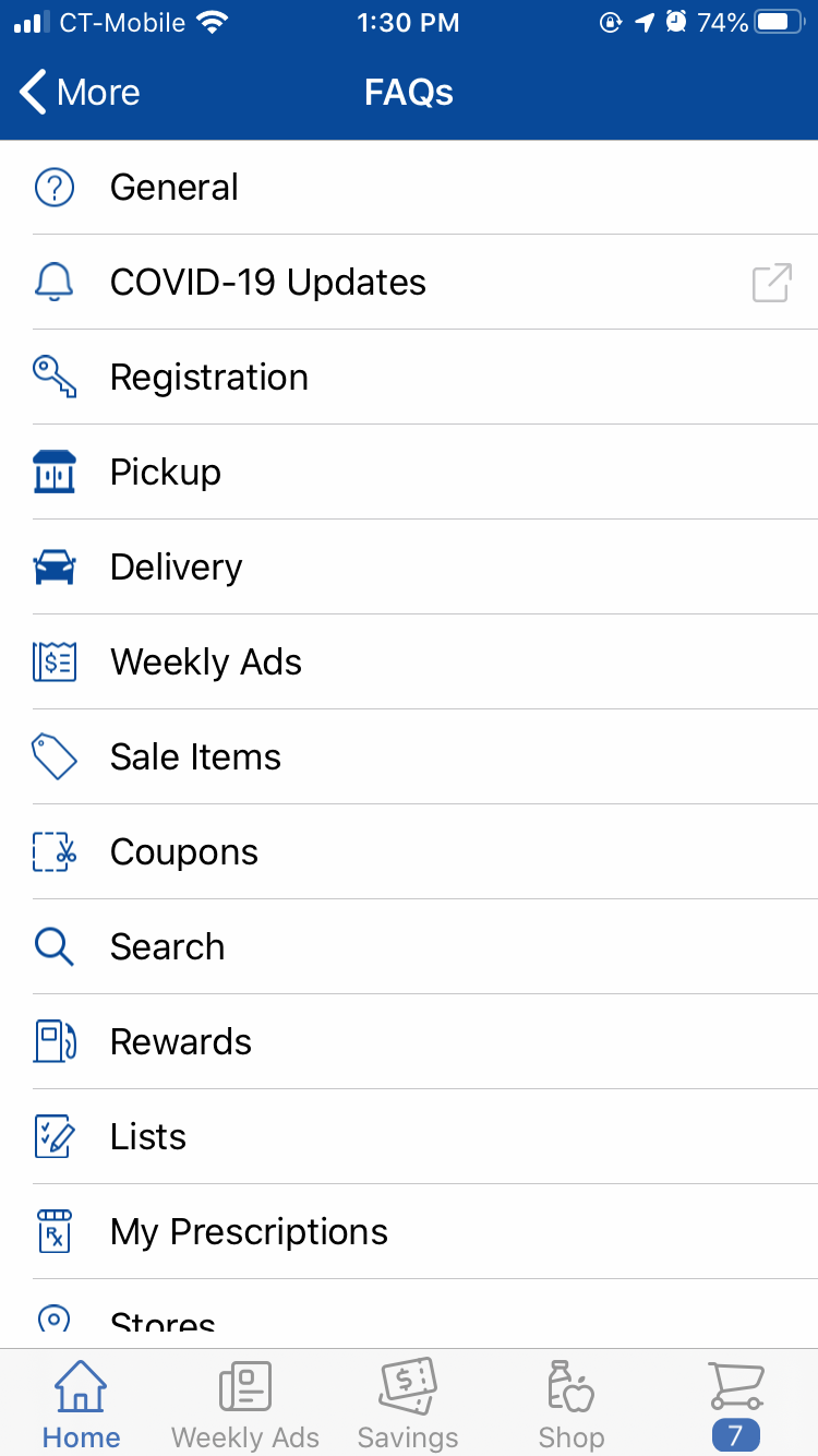
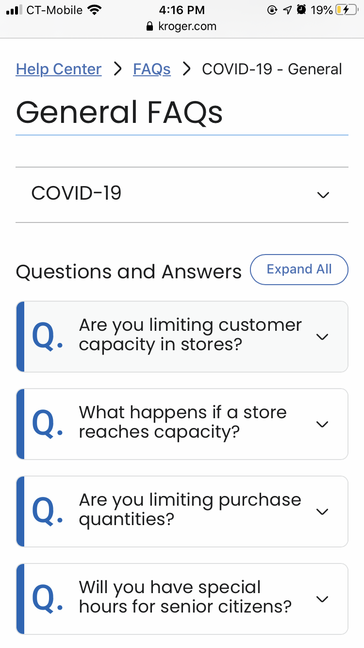
screenshots from the Kroger app
Give users freedom to choose alternatives if desired items are unavailable
What do we do when there are no disinfectant wipes or toilet paper? Unable to get a desired item is usually the biggest frustration for users in the online grocery shopping experience. Even if the remaining parts of the shopping experience are excellent, it can hardly make up for the frustration. However, it is inevitable that some of the products are out of stock. Let’s see what Instacart is doing to avoid frustration or keep frustration to a minimum.
Instacart provides three options to the users if an item is unavailable.
- Shoppers (who shop on behalf of the Instacart users) choose a similar item.
- Users designate a substitute item.
- Leave out the item when unavailable.
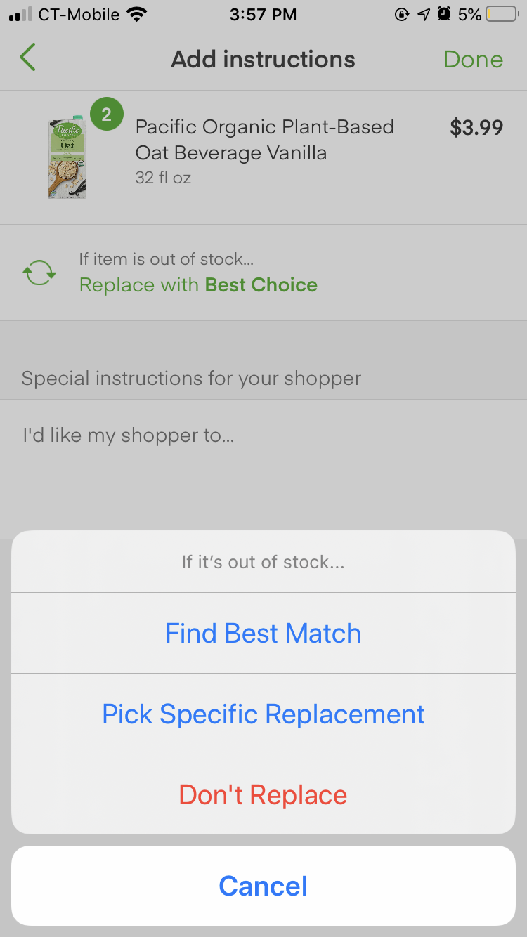
screenshot from the Instacart app
Increase information clarity when setting up pick-up and delivery times
Increasing information clarity means providing key information for users to make decisions. It doesn’t mean to provide as much information as possible, but to provide them with just the right information. Sometimes users cannot explicitly tell what they want. It requires UX Designers to think deeper about their users’ motivations.
Due to the high demands of pick-up and delivery requests, customers can feel stressed about losing their desired time slots. Being transparent is the best way to help them make the right decisions in a timely manner. For example, Kroger shows available spots for each pick-up time slot. Walmart shows delivery fees for each delivery time slot.
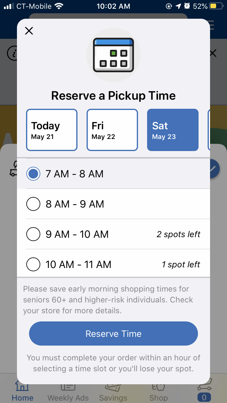
screenshot from the Kroger app
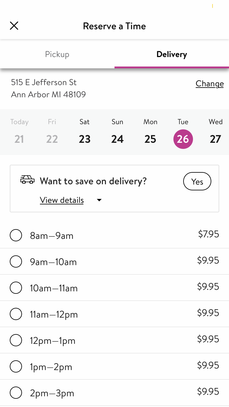
screenshot from the Walmart app
Track carrier’s location in real-time
Many people feel anxiety when they are about to get their items after being informed that a delivery person has departed from the grocery stores. Do they have time to go out for a run? Will the delivery arrive in the next 5 minutes or 120 minutes? Waiting is always hard. Visualizing the process of waiting and letting users know how long they are expected to wait, can ease the anxiety.
Amazon’s Prime Now does a great job with this by showing the carrier’s real-time location on a map when the user’s order is out for delivery.
![]() screenshot from the Prime Now app
screenshot from the Prime Now app
Users can see a dot moving on the map, unlike other apps telling the users that they will receive the order in 2 hours. Visualizing the delivery process is more tangible and provides users a more precise estimation of when they will receive the order.
To create a good user experience during this pandemic, we can expand the techniques mentioned above and conclude that good UX designs give users a sense of safety by providing information about the latest updates of COVID-19, being prepared for uncertainty, increasing information clarity, and making things trackable. The concepts in designing a good online grocery experience also apply to the UX design of other apps. Logic Solutions has top notch UI/UX designers and developers that can provide a user experience that your customers will want to use over and over!
Neither Logic Solutions, Inc., nor its officers or owners, are affiliated with any of the products or services mentioned in this post.